
Hey Traders, Terry here with TradingAnalysis.com. It’s been an incredibly busy start to the year with considerable strength in the first quarter, but in the last few weeks we’ve begun a corrective move lower. Are we in for more pain? Today I just wanted to share with you our outlook here at TradingAnalysis on sector rotations as we track this corrective move lower in the broader market indexes.
Todd Gordon, our Founder and CEO, shared his outlook with CNBC viewers this morning:
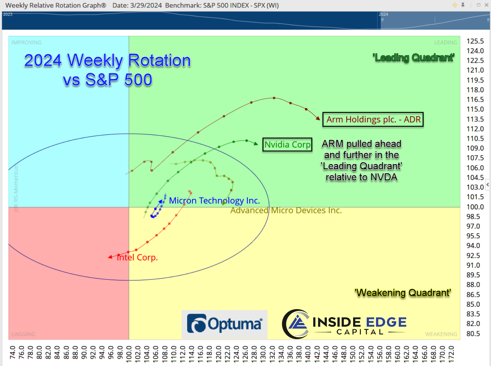
On air Todd was referring to the latest weapon in our trading arsenal called Relative Rotation Graphs. It’s a completely unique way to track relative strength and weakness in real time of a group of stocks against a central index or benchmark. In fact Todd liked this tool so much he went out and recruited the creator of this tool, Julius de Kemepnear, to join the team at TradingAnalysis.com.
Following up on Todd’s comments on CNBC, as Todd was delivering his Flash’s First Word video to our MAPS Trader subscribers this morning, I told Todd that my interpretation of the Sector Rotation aligned exactly with what he just said. The general consensus out there is that we are in a broader market correction that will see value stocks (think Staples, Utilities, Healthcare) continuing to lead the way. However, the tails of the Value sectors are long and getting mature and the probability is increasing that they start to fade and keep XLK, XLC monthly vectors in the Leading position.

Here is the Monthly Relative Rotation Graph (RRG for short) for the eleven sectors benchmarked to the SPX. On the left, the longer-term Monthly vectors show the Communications sector and the Technology Sector to the right of center, indicating much higher relative strength versus the benchmark SPX while the Value sectors are all to the left of the center, indicating lower long-term relative strength versus the benchmark SPX. Each line segment represents one month’s worth of movement. The headings of the vectors, or simply direction the arrow is traveling, tell us that XLC and XLK are in a period of declining relative momentum; however, they are both holding a fairly steady relative strength condition. Many of the Value-oriented sectors are seeing the opposite, gaining relative momentum though not gaining much relative strength.
On the chart above is the Weekly RRG with a shorter-term analysis. Each line segment represents one week’s worth of movement. Here, we see the XLI, XLF, and XLC sectors having the highest relative strength with the XLE and the XLB sectors moving into the Leading Quadrant. At the same time, we’ve seen the XLK sector move to the left, losing relative strength versus the benchmark SPX while there is a mix of Value sectors gaining and losing relative strength.
What’s the takeaway? The value sectors are trying their best to move to the right half of the weekly and monthly RRG above sign, which would force the offensive growth names to the underperforming left half triggering a likely broader market sell-off. Will it happen? It’s a bit too early to tell. But whatever the result, either Growth stays in the driver’s seat or Value takes over, it will have a definitive and significant impact on the direction of the broader stock market averages. Stay tuned here for updates as we gain more clarity.
Here at TradingAnalysis, we incorporate a variety of technical and fundamental analysis tools into our trading plan and continually adjust the types of stocks that we include in our short-term portfolios based on where we see strength developing and heading. In our MAPS Trader service, we combine macroeconomic analysis with key fundamental analysis to identify opportunistic trades. Our technical analysis, including Julius de Kempenaer’s RRGs and Elliott Wave analysis, provides the foundation for our trade setups.
If you’re not currently a MAPS Trader subscriber, I highly recommend you give our service a try. If you want to stay ahead of the ever-changing market landscape and consistently outperform the SPX, then you should seriously consider following our market commentary. Hope to see you in the member’s area soon!
Terry
Did you enjoy the article? We’ve got more!
Market Analysis Portfolio Suite…MAPS.
It’s our newest release in elite research, strategy, education, alerts, and one-on-one with his top trading experts.
Check it out and sign up for a membership here:
View the full CNBC interview with Todd HERE